
|
 11-19-2007, 09:27 PM
|
#1 |
|
Senior Member
Join Date: Dec 2006
Location: Goose Creek, SC
Posts: 5,481
|
I need help with a new website logo. I'd like to see if any of you can come up with something, or give me advise with my logo. If we get a couple different logo's I'll set up a poll to see what everyone likes.
I'm not very creative, so I need a lot of help. Right now there are 2 logos on the site which I originally put together when I created the site. I really don't like either logo. Here is 1 I just came up with. I like the simplicity of it, but I'd still like to see some improvement. |

|

|
|
11-19-2007, 09:47 PM
|
#2 |
|
Senior Member
Join Date: Dec 2006
Location: Goose Creek, SC
Posts: 5,481
|
I really like how f150 did theirs. Simple but nice.

|
|
|
|
|
11-19-2007, 09:58 PM
|
#3 |
|
Senior Member

Join Date: Feb 2007
Posts: 1,015
  |
Logo looks good Mike !
|
|
|
|
|
11-19-2007, 09:59 PM
|
#4 | |
|
Senior Member
Join Date: Dec 2006
Location: Goose Creek, SC
Posts: 5,481
|
Quote:
Is it me or does it seem like Chris is drinking too much tonight? |
|
|
|
|
|
11-19-2007, 10:01 PM
|
#5 | ||
|
Neo is Jesus

Join Date: Jan 2007
Posts: 13,265
|
Quote:
Can you leave this open for a month and get some ideas?
__________________
Gap A Hoe Racing
 |
||
|
|
|
|
11-19-2007, 10:08 PM
|
#6 | ||
|
Senior Member
Join Date: Dec 2006
Location: Goose Creek, SC
Posts: 5,481
|
Quote:
Please explain the navy comment. What do I need to do to make it less "navy" Quote:
|
||
|
|
|
|
11-19-2007, 10:12 PM
|
#7 |
|
Moderator

Join Date: Dec 2006
Location: West Ashley
Posts: 2,498
|
I like the first one, although I think it would look better if the state line between North and South Carolina could be added.
|
|
|
|
|
11-19-2007, 10:13 PM
|
#8 | ||
|
Neo is Jesus
Join Date: Jan 2007
Posts: 13,265
|
Quote:
__________________
Gap A Hoe Racing
|
||
|
|
|
|
11-19-2007, 10:17 PM
|
#9 | |
|
Senior Member
Join Date: Dec 2006
Location: Goose Creek, SC
Posts: 5,481
|
Quote:
Chris.. you have a point. So would you like it more if it was a different color? Give me a color, and I'll change the map to it. It better not be pink. |
|
|
|
|
|
11-19-2007, 10:22 PM
|
#10 |
|
Senior Member

Join Date: Dec 2006
Location: Goose Creek, SC
Posts: 3,159
|
Maybe you can put this Mr Horsepower logo in Carolina theme.
[img] 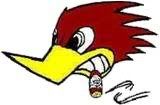 [/img] [/img]
__________________
05 Saleen, 91 Mustang LX, 99 Lightning  
|
|
|
|
|
11-19-2007, 10:26 PM
|
#11 | |
|
Moderator
Join Date: Dec 2006
Location: West Ashley
Posts: 2,498
|
Quote:
|
|
|
|
|
|
11-19-2007, 10:29 PM
|
#12 |
|
Neo is Jesus
Join Date: Jan 2007
Posts: 13,265
|
Would it be too bad if you took the first logo and put a confederate flag over it? Or maybe a palmetto flag?
__________________
Gap A Hoe Racing
|
|
|
|
|
11-19-2007, 10:33 PM
|
#13 | |
|
Senior Member
Join Date: Dec 2006
Location: Goose Creek, SC
Posts: 3,159
|
Quote:
__________________
05 Saleen, 91 Mustang LX, 99 Lightning
|
|
|
|
|
|
11-19-2007, 10:35 PM
|
#14 | ||
|
Neo is Jesus
Join Date: Jan 2007
Posts: 13,265
|
Quote:
__________________
Gap A Hoe Racing
|
||
|
|
|
|
11-19-2007, 10:42 PM
|
#15 | |
|
Senior Member
Join Date: Dec 2006
Location: Goose Creek, SC
Posts: 5,481
|
Quote:
Trying to keep it very simple. I really don't think it will look good with a bunch of stuff in it. Aiming to have something like this:
|
|
|
|
|
|
11-19-2007, 10:44 PM
|
#16 |
|
Neo is Jesus
Join Date: Jan 2007
Posts: 13,265
|
Actually that looks alot better!
__________________
Gap A Hoe Racing
|
|
|
|
|
11-19-2007, 10:53 PM
|
#17 |
|
Moderator
Join Date: Dec 2006
Location: West Ashley
Posts: 2,498
|
Try some different fonts. Make the words "look faster", sleeker?, like it's cutting through the wind.
|
|
|
|
|
11-20-2007, 01:55 AM
|
#18 |
|
Moderator

Join Date: Jan 2007
Location: Goose Creek SC
Posts: 554
|
I like it I want 4 total two XXL and two XL, Mitch
|
|
|
|
|
11-20-2007, 03:58 AM
|
#19 |
|
Senior Member

Join Date: Aug 2007
Location: Savannah GA
Posts: 1,725
|
All in all it looks ok. Just the letters need some work. They are to blocked
they need to have some curve to them. Or if you want something a little different. how about. CAROLINA HORSEPOWER then have zommies with flames on the sides |
|
|
|
|
11-20-2007, 06:45 AM
|
#20 |
|
Senior Member
Join Date: Dec 2006
Location: Goose Creek, SC
Posts: 3,159
|
Mike if you were talking about the shading and font in the f-150 logo then yes it looks nice. I thought you were doing the outline of the truck with Carolina Horse Power in the outline. That was the way I was getting it. Don't matter either way.
__________________
05 Saleen, 91 Mustang LX, 99 Lightning
|
|
|
|
 |
|
|


 Linear Mode

